http://jsfiddle.net/L55w9n53/
$(function () {
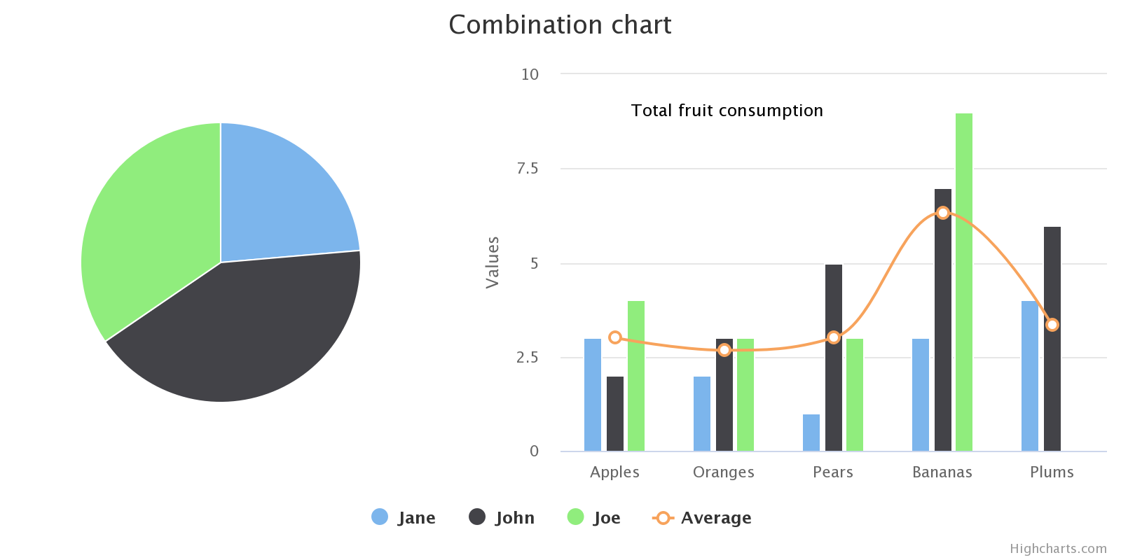
Highcharts.chart(‚container‘, {
chart: {
marginLeft: 400
},
title: {
text: ‚Combination chart‘,
},
xAxis: {
categories: [‚Apples‘, ‚Oranges‘, ‚Pears‘, ‚Bananas‘, ‚Plums‘],
// width: 100,
// left: 500
},
yAxis: {
// offset: -100
},
labels: {
items: [{
html: ‚Total fruit consumption‘,
style: {
left: ’50px‘,
top: ’18px‘,
color: (Highcharts.theme && Highcharts.theme.textColor) || ‚black‘
}
}]
},
series: [{
type: ‚column‘,
name: ‚Jane‘,
data: [3, 2, 1, 3, 4]
}, {
type: ‚column‘,
name: ‚John‘,
data: [2, 3, 5, 7, 6]
}, {
type: ‚column‘,
name: ‚Joe‘,
data: [4, 3, 3, 9, 0]
}, {
type: ’spline‘,
name: ‚Average‘,
data: [3, 2.67, 3, 6.33, 3.33],
marker: {
lineWidth: 2,
lineColor: Highcharts.getOptions().colors[3],
fillColor: ‚white‘
}
}, {
type: ‚pie‘,
name: ‚Total consumption‘,
data: [{
name: ‚Jane‘,
y: 13,
color: Highcharts.getOptions().colors[0] // Jane’s color
}, {
name: ‚John‘,
y: 23,
color: Highcharts.getOptions().colors[1] // John’s color
}, {
name: ‚Joe‘,
y: 19,
color: Highcharts.getOptions().colors[2] // Joe’s color
}],
center: [‚-75%‘, ‚50%‘],
size: 200,
showInLegend: false,
dataLabels: {
enabled: false
}
}]
});
});